Led a full redesign of the app experience
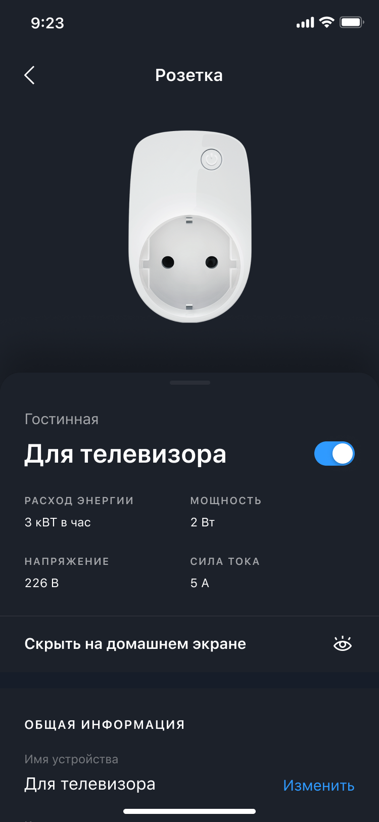
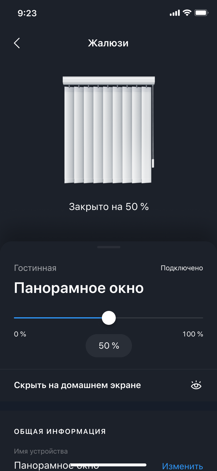
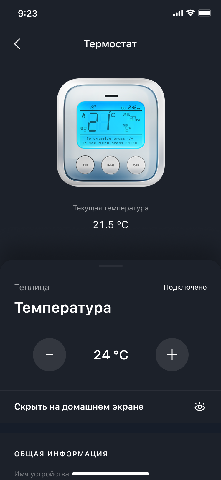
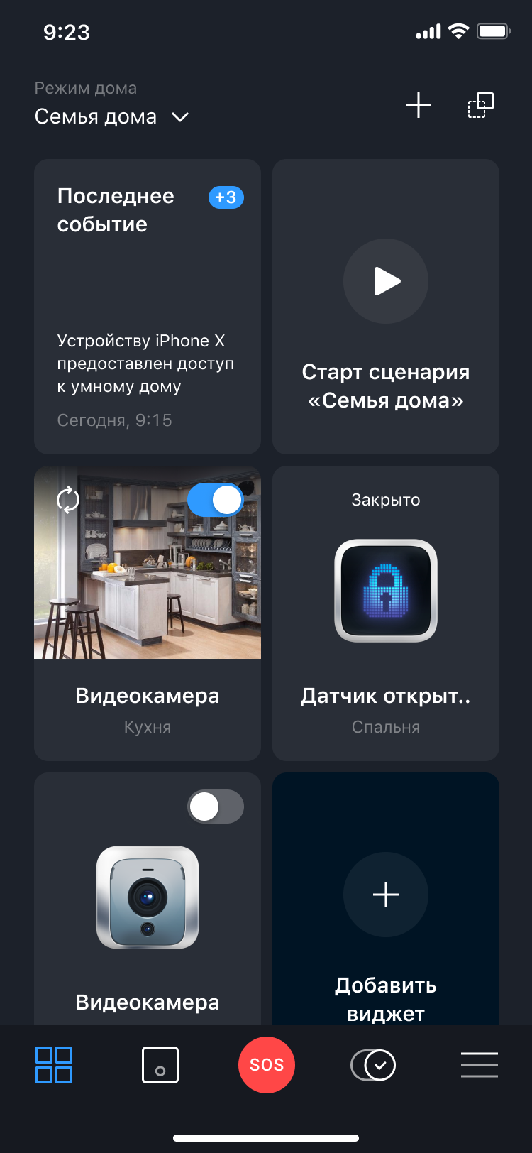
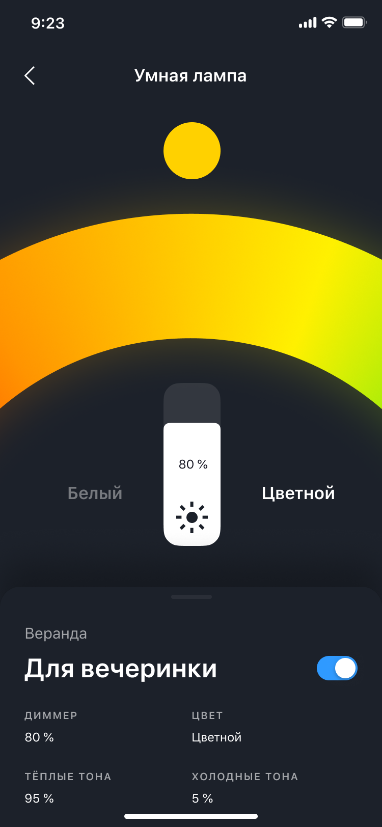
We refreshed navigation, visual language, and interaction patterns to make the app clearer and more modern, while keeping it fast for daily use
A consumer app that connects and manages smart devices
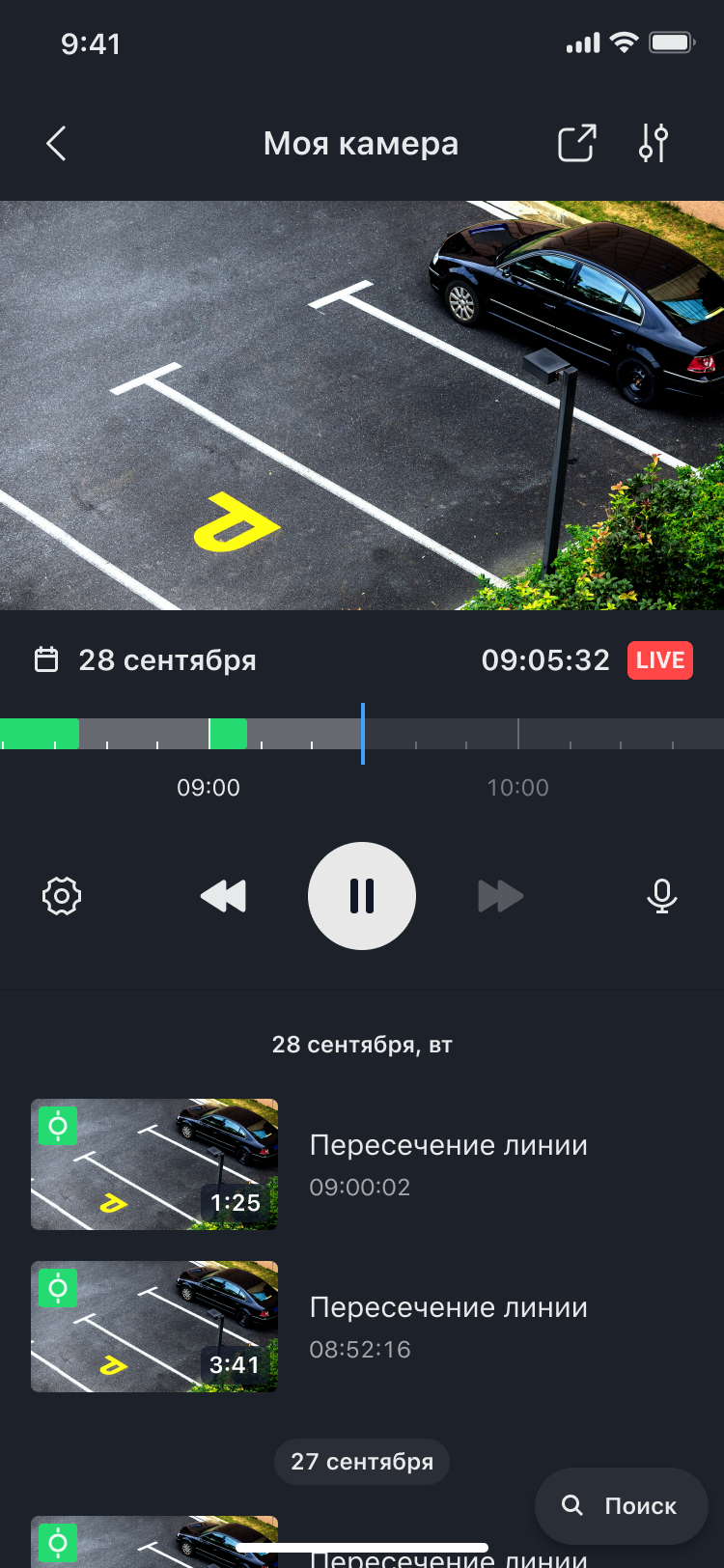
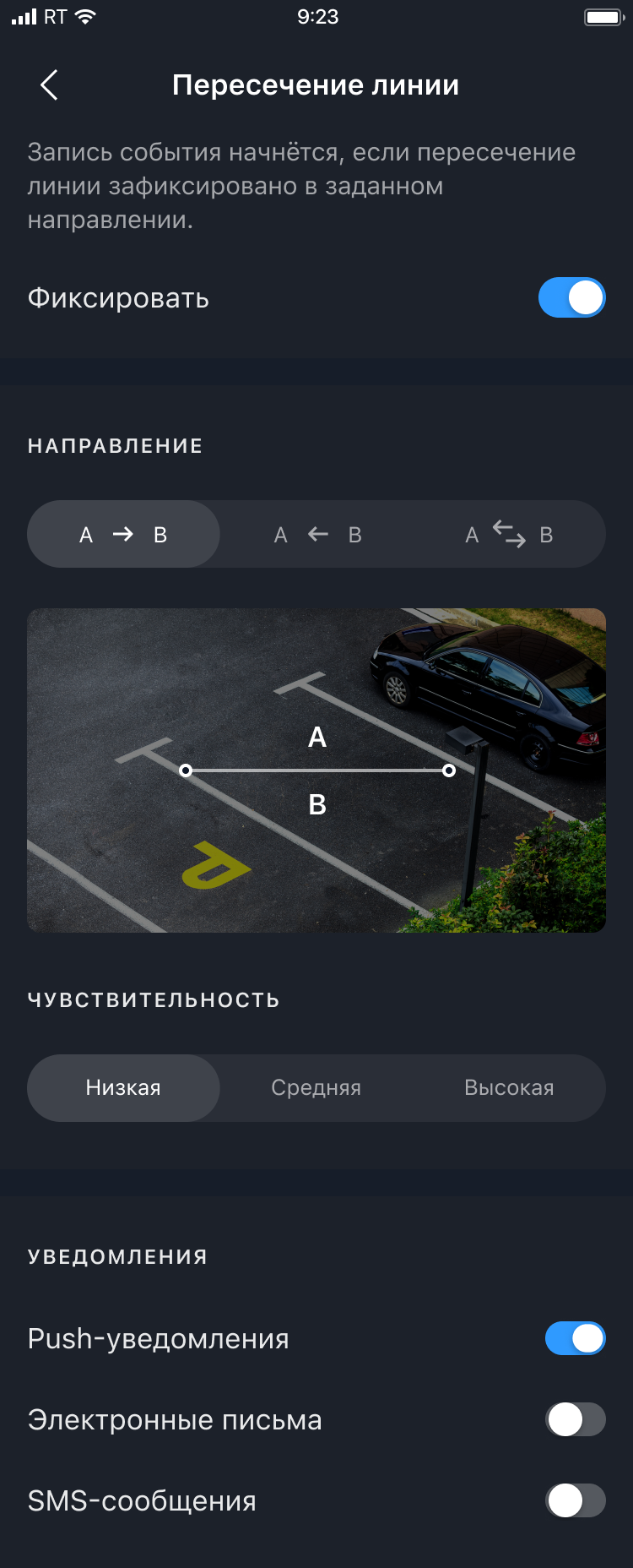
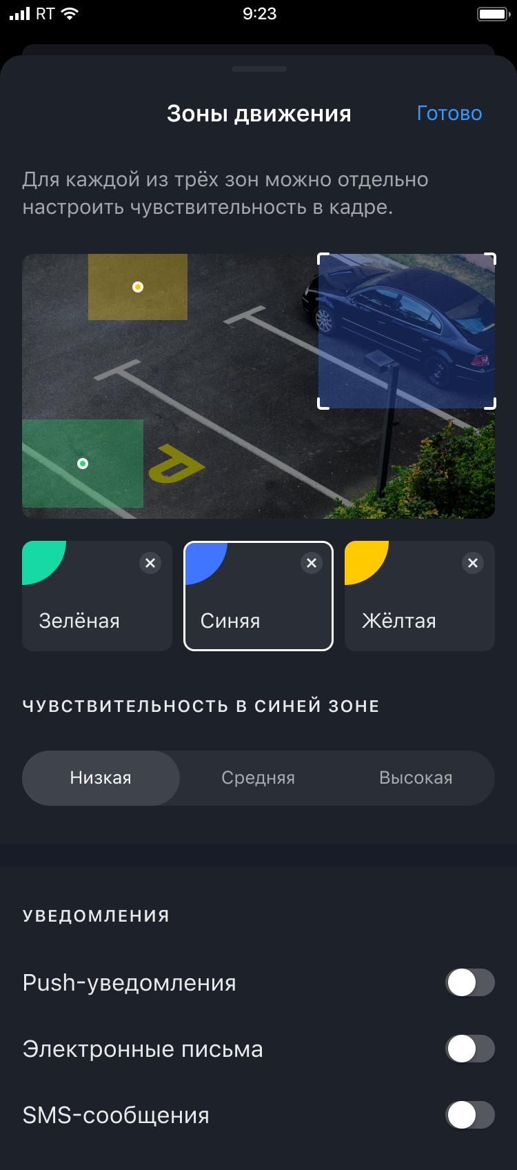
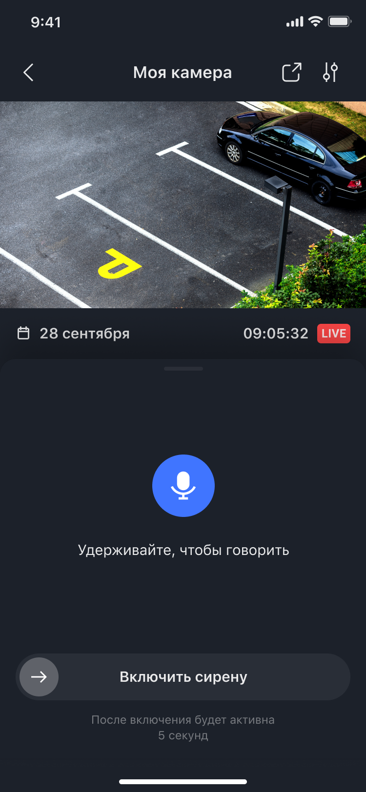
Product Designer → Design Team Lead I worked hands-on as a designer and later led design delivery. I owned UX direction, research, and cross-functional alignment with product and engineering, with a strong focus on improving the camera experience
We refreshed navigation, visual language, and interaction patterns to make the app clearer and more modern, while keeping it fast for daily use
We combined:
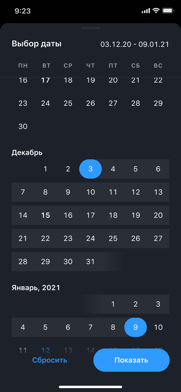
We defined what we needed to learn: how people use the timeline, how they review a specific event, what actions are most used, which settings matter, and how people search for events
A single place to watch live,
scrub the timeline, and review
events with previews and
timestamps