First-screen digital concept with strong rebel tone
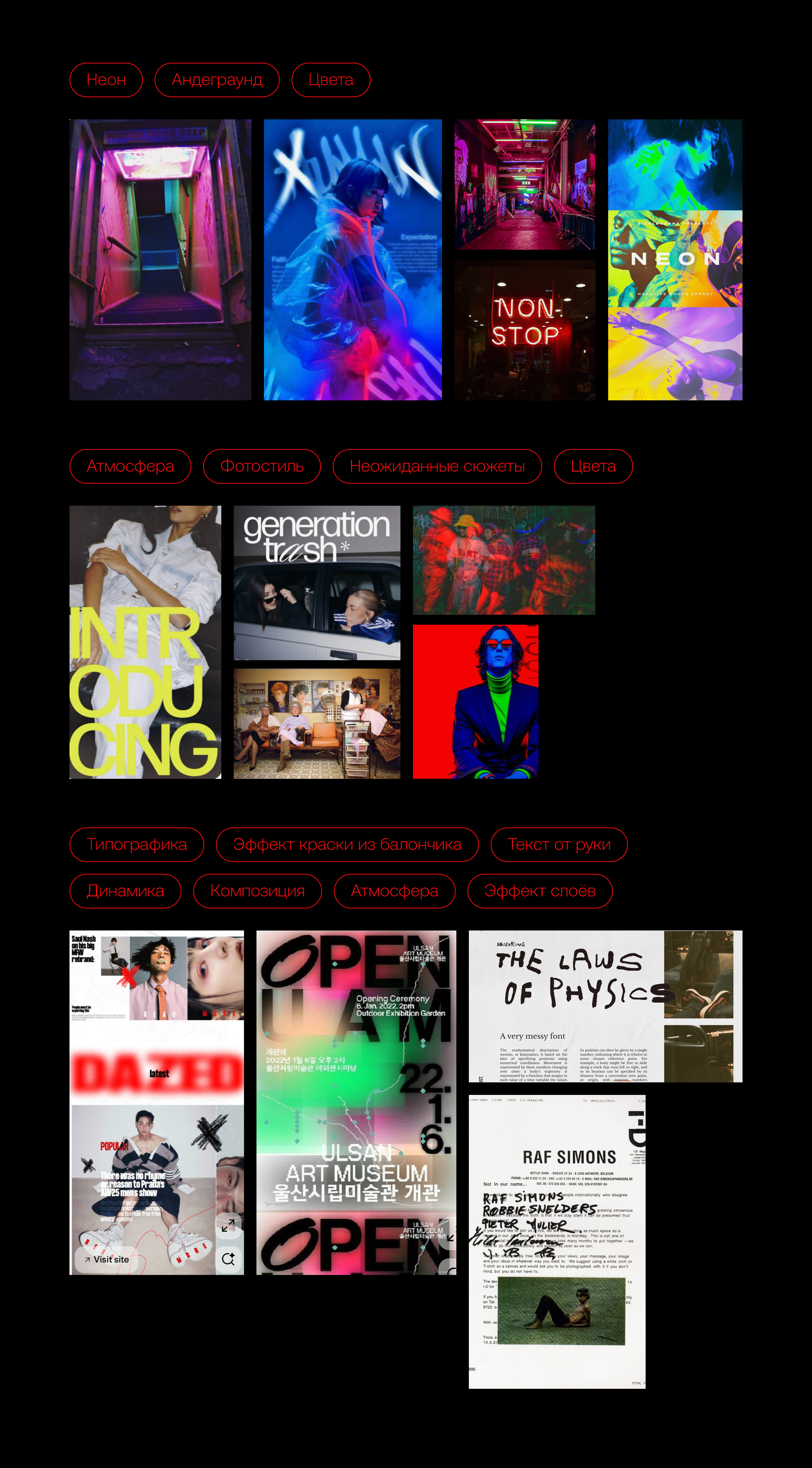
Visual language principles for typography, composition, and attitude-driven UI storytelling
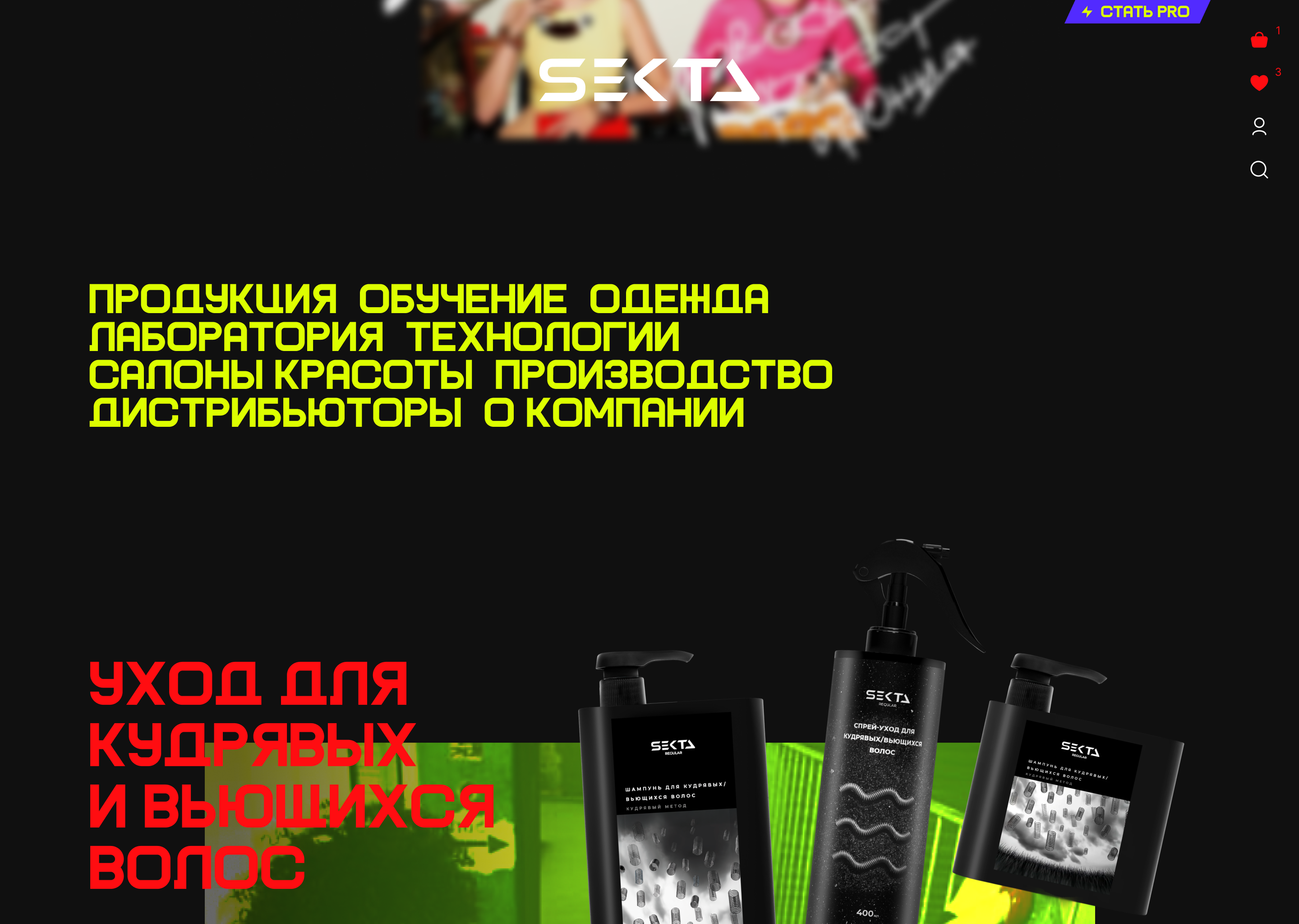
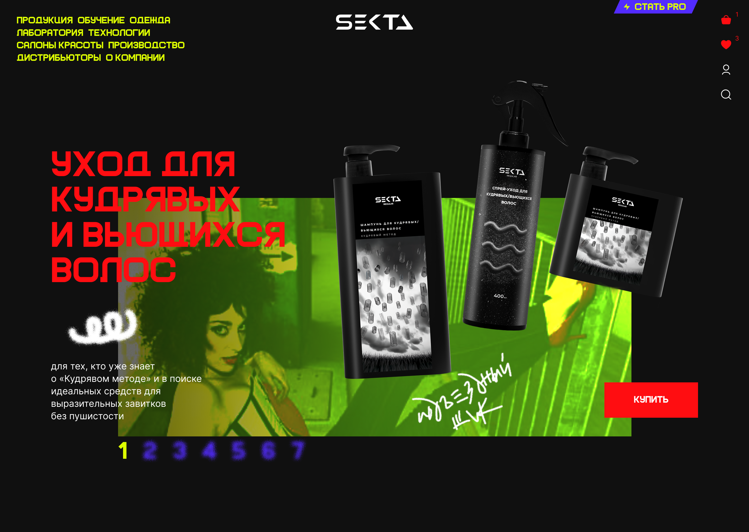
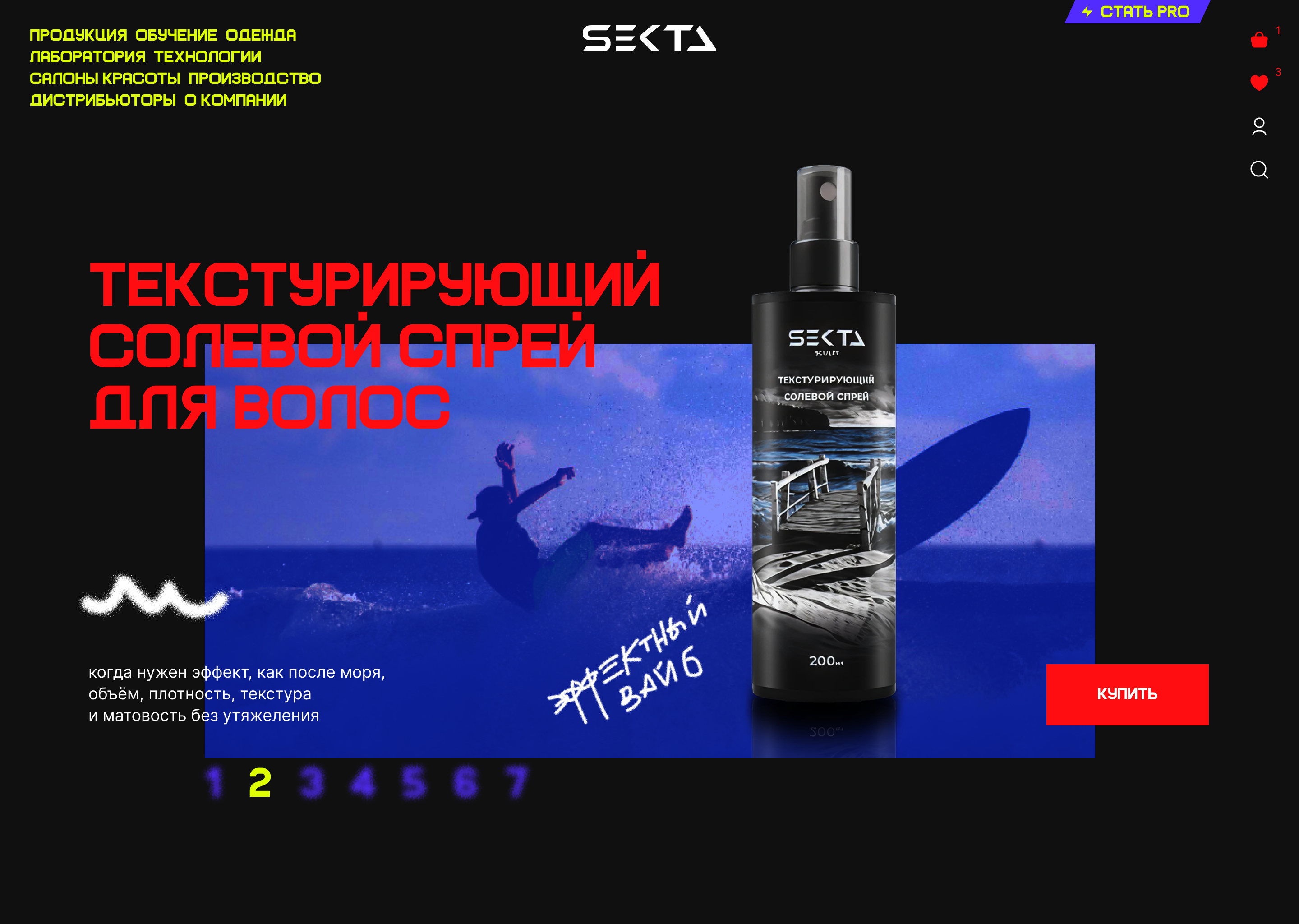
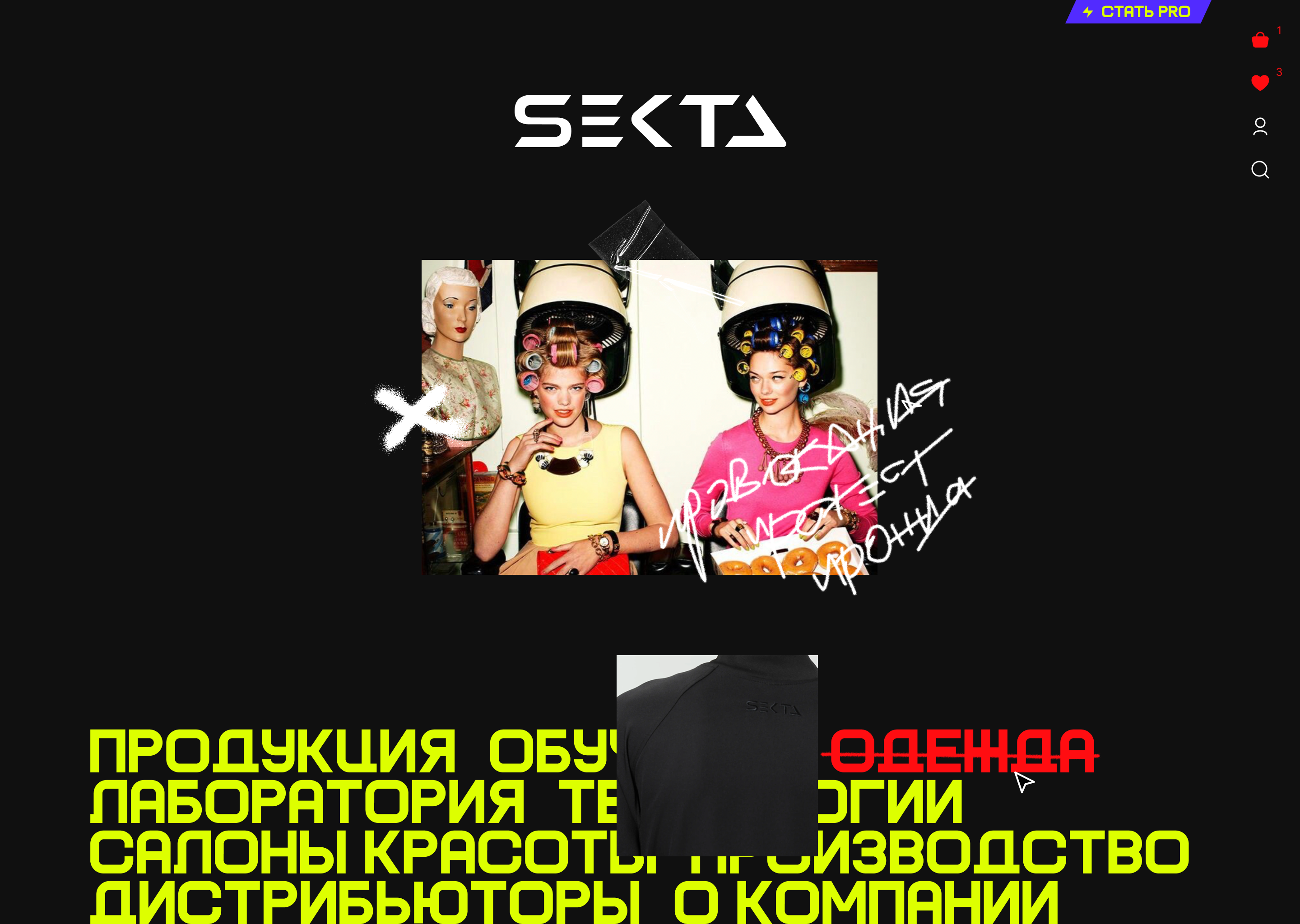
Online store of a brand offering a suite of services for beauty salons and stylists
Product Art Director, Product Designer I led the concept direction and designed the core digital concept. My scope included visual strategy, tone-of-voice in interface, and first product screens that translated brand personality into a web experience
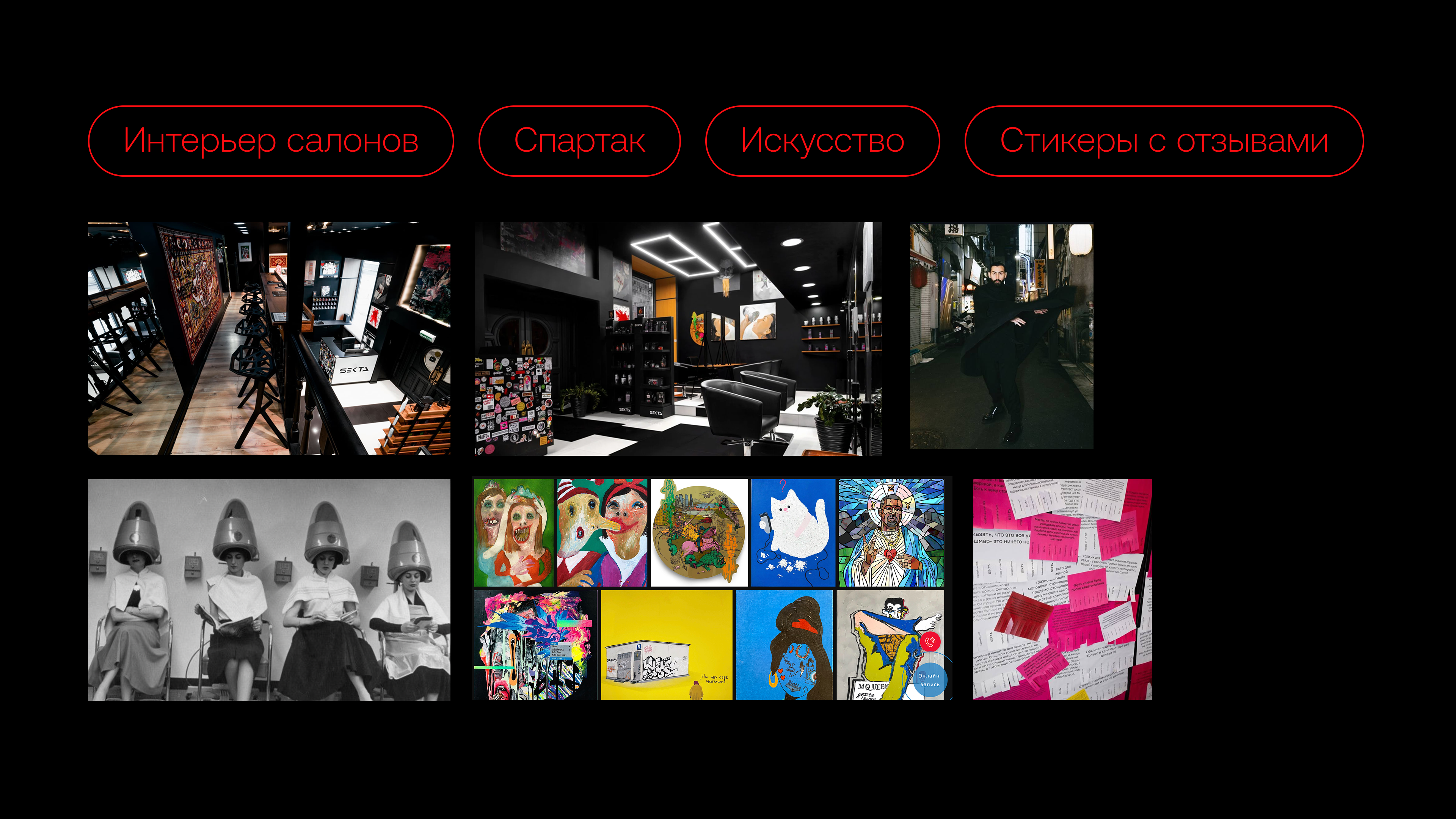
The founder, Spartak, had a provocative public style: irony, protest, and deliberate tension. So the concept had to be risky but controlled - rebellious enough to stand out, yet structured enough to work as a real product direction
Visual language principles for typography, composition, and attitude-driven UI storytelling
Presale-ready concept package to support pitch narrative and differentiation
I used real brand signals: salon environment references, founder image and personality cues, contemporary experimental art references for a potential gallery direction I also considered Spartak's communication pattern: he publicly reframed negative reviews as hype and social proof. That helped define the concept tone
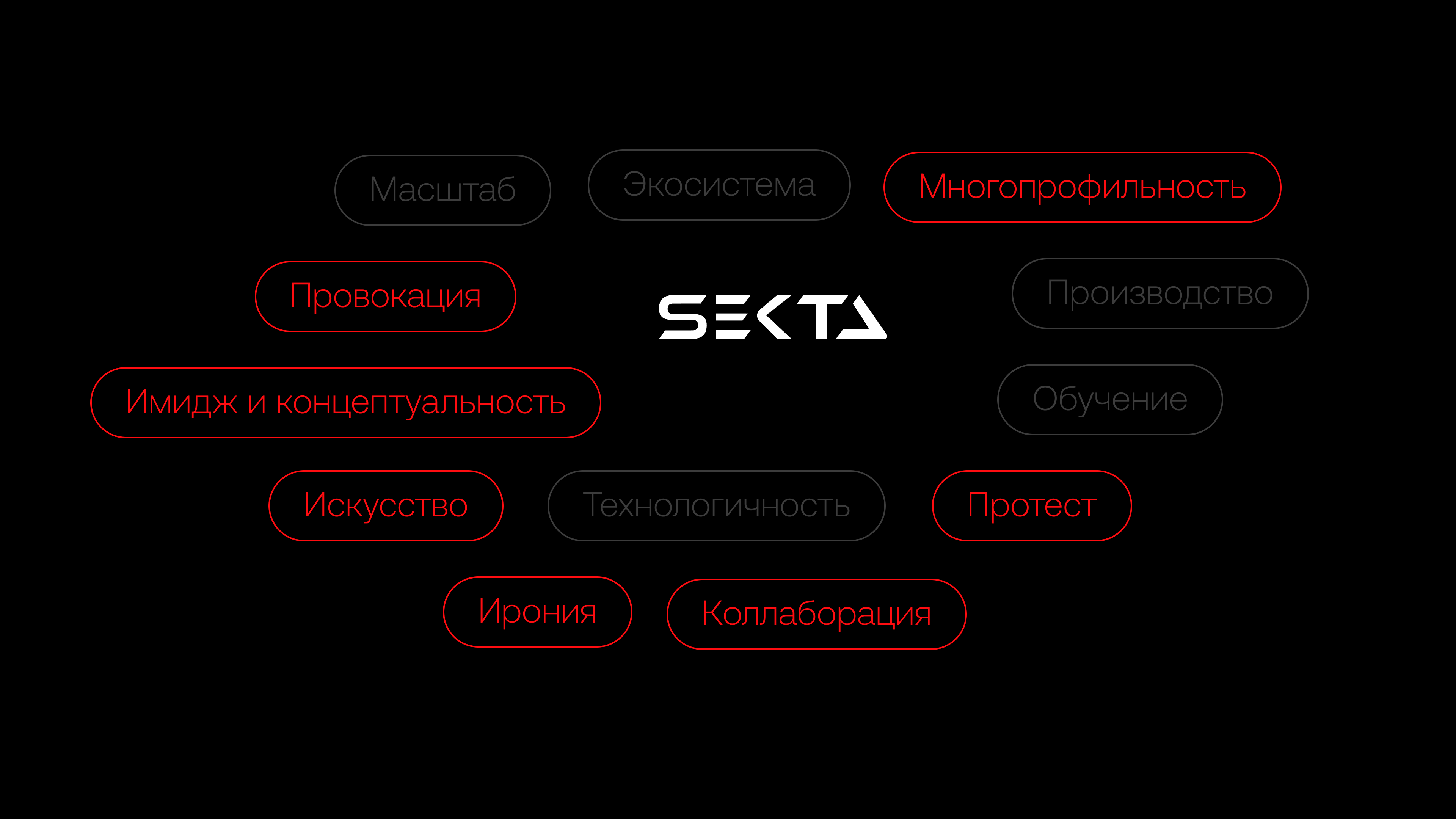
The core idea was to treat the interface as a provocative brand stage. Keywords embedded in the concept: provocation, protest, irony This direction shifted the website from "service catalog" to "cultural statement with commerce," where style, attitude, and conversion can coexist