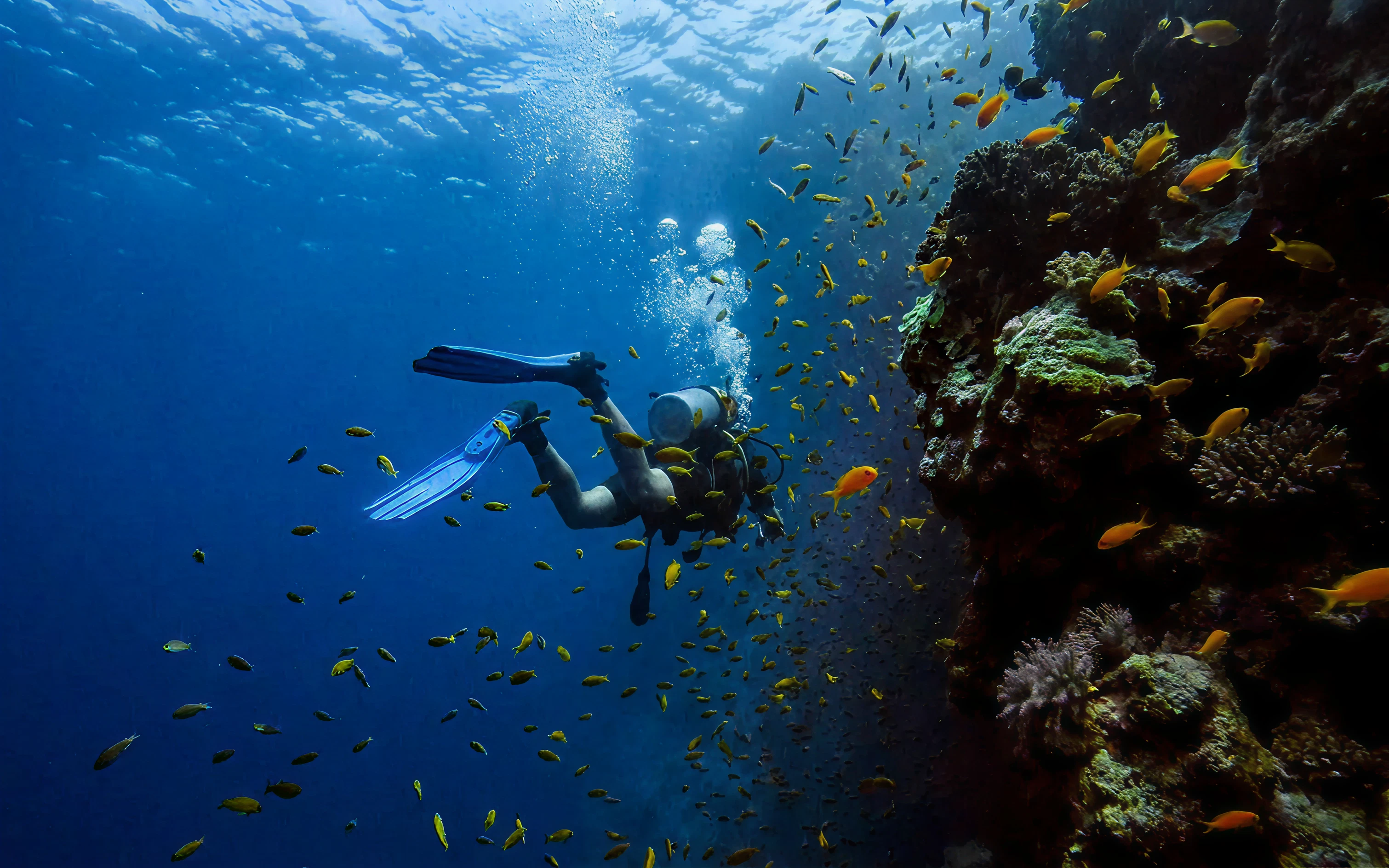
DIVESHOP
An early product stage online store focused on divers in Portugal and EU
My role
Product Art Director, Product Designer, Brand Designer I led brand strategy and visual direction, created the identity system (logo, sign, colors, typography), designed merch/social artifacts, and started product design exploration through MVP vibe shots
The challenge
Quick project launch
The business needed a distinct identity in a niche market where most stores look either too generic sports-retail or too technical. The challenge was to build a brand that feels credible for serious divers, still accessible for newer users, and flexible enough to move into product UI for an MVP store experience
Key releases
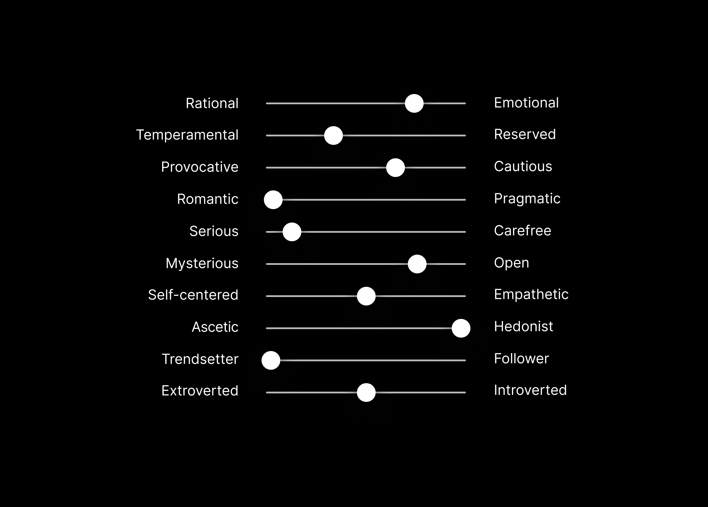
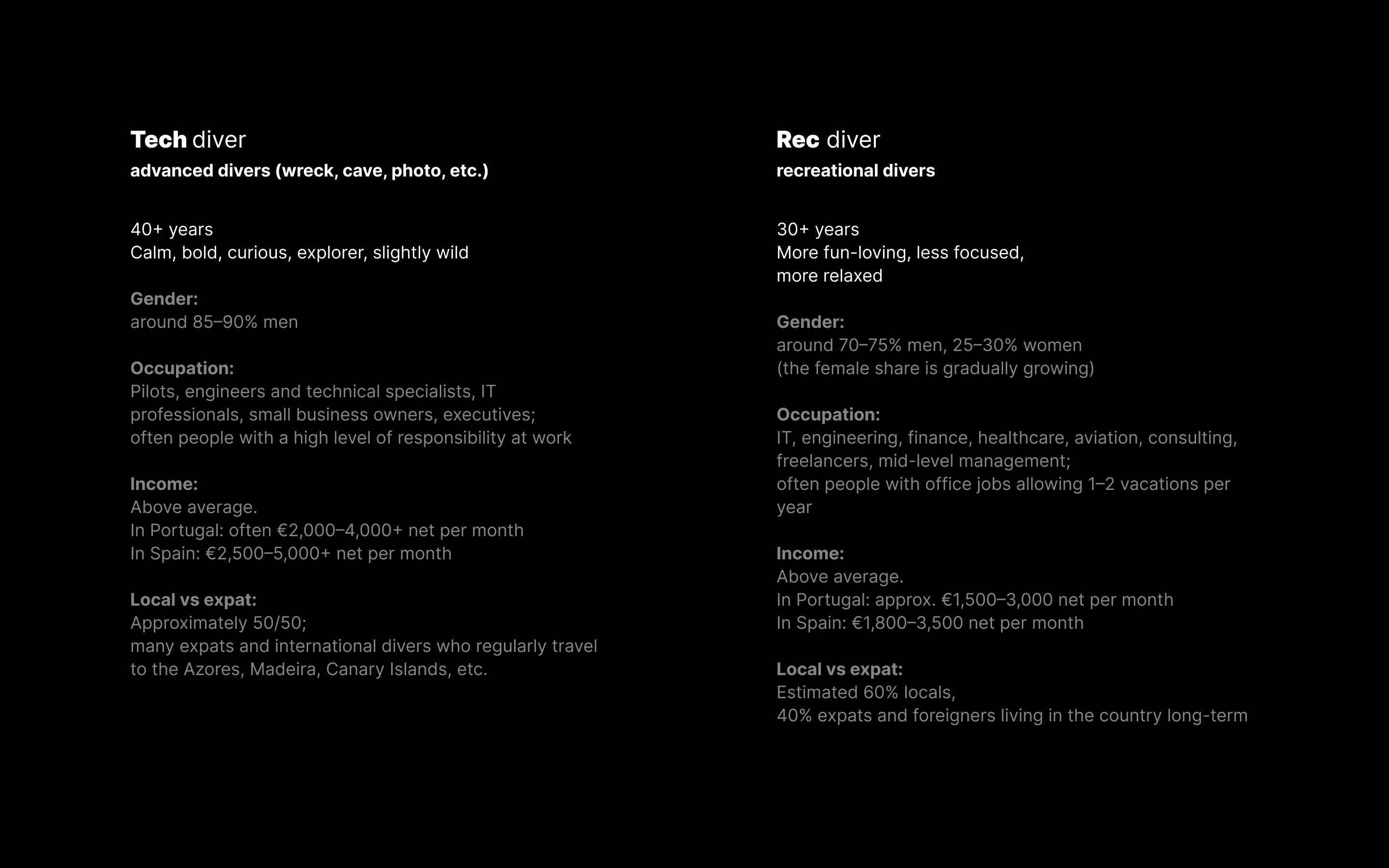
Brand personality and buyer logic
I used a brand character framework and buyer personas (tech divers vs recreational divers) to align tone, language, and visual behavior
Positioning into value proposition and messaging
I shaped the core promise and built slogan directions for product, merch, and social
Unique Value Proposition
- Flexible, convenient approach
- End-to-end purchase support
- Complete beginner gear packages
- Clear categories: Beginner, Advanced, Pro
Slogans

Phrases for merch, social

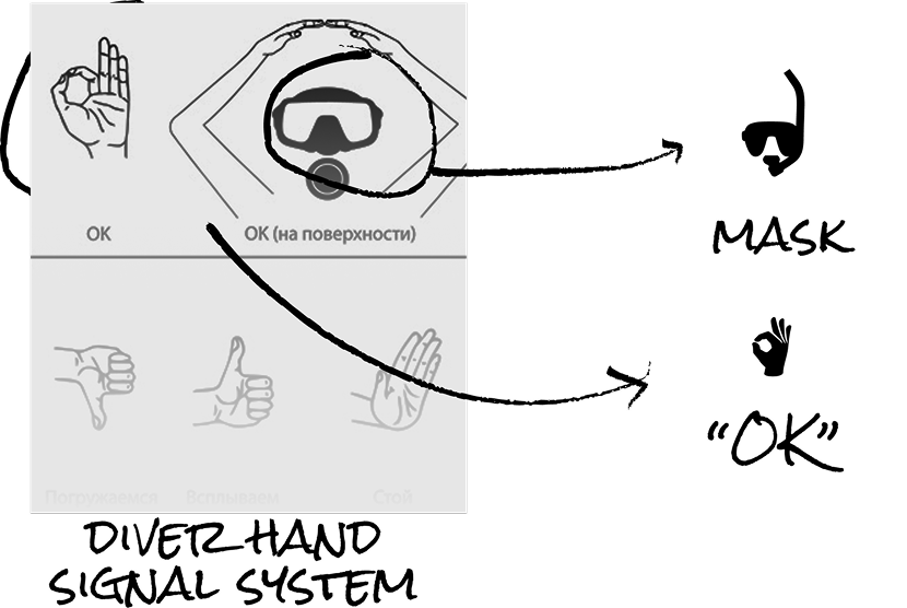
Logo creation
I mapped the conceptual path from diving semantics and hand-signal references to the final mark structure

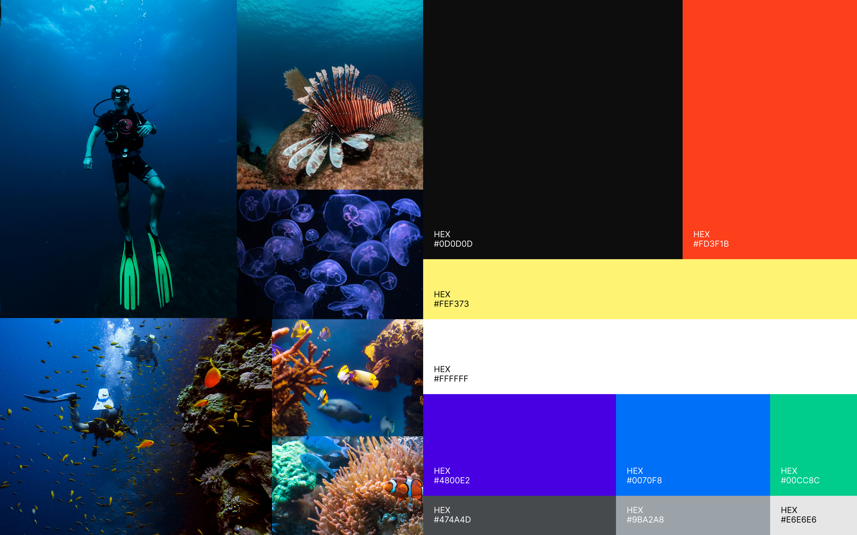
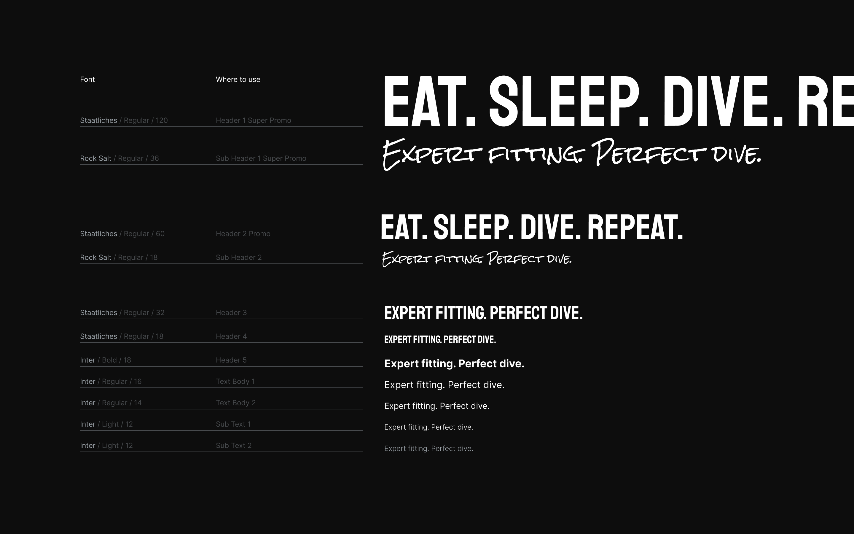
Identity system
Color palette, and typography rules to create a consistent but expressive system across channels
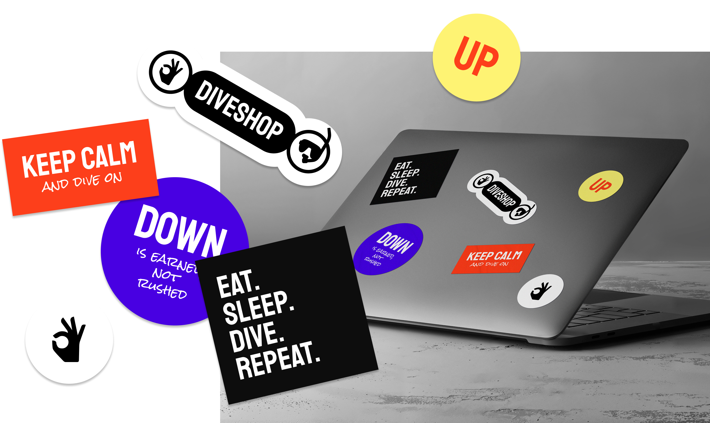
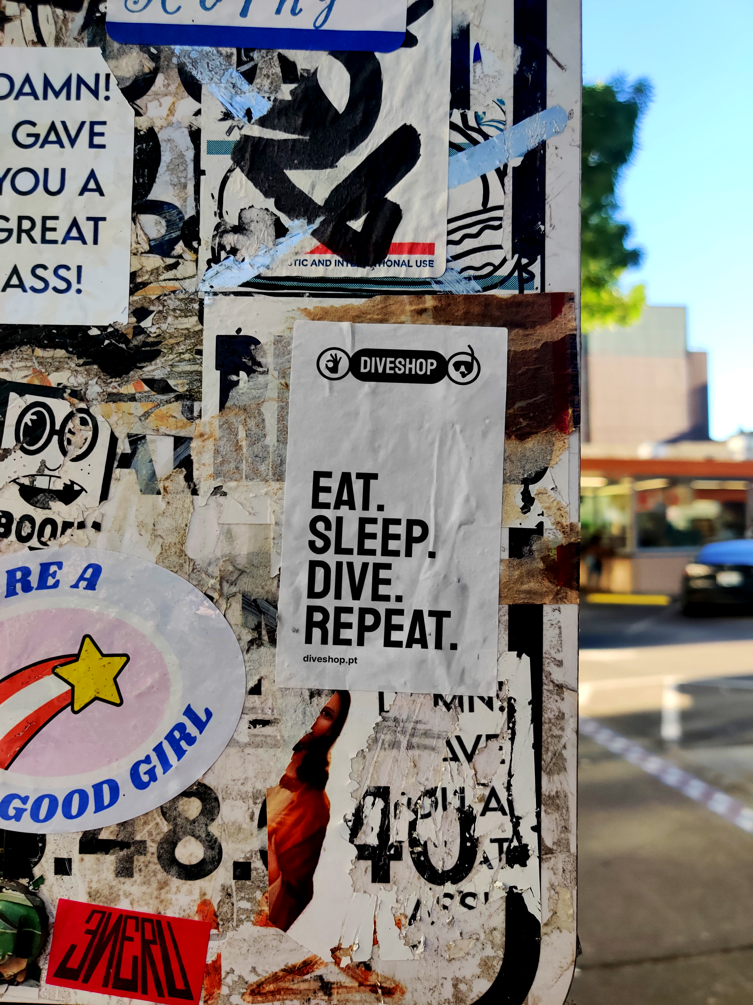
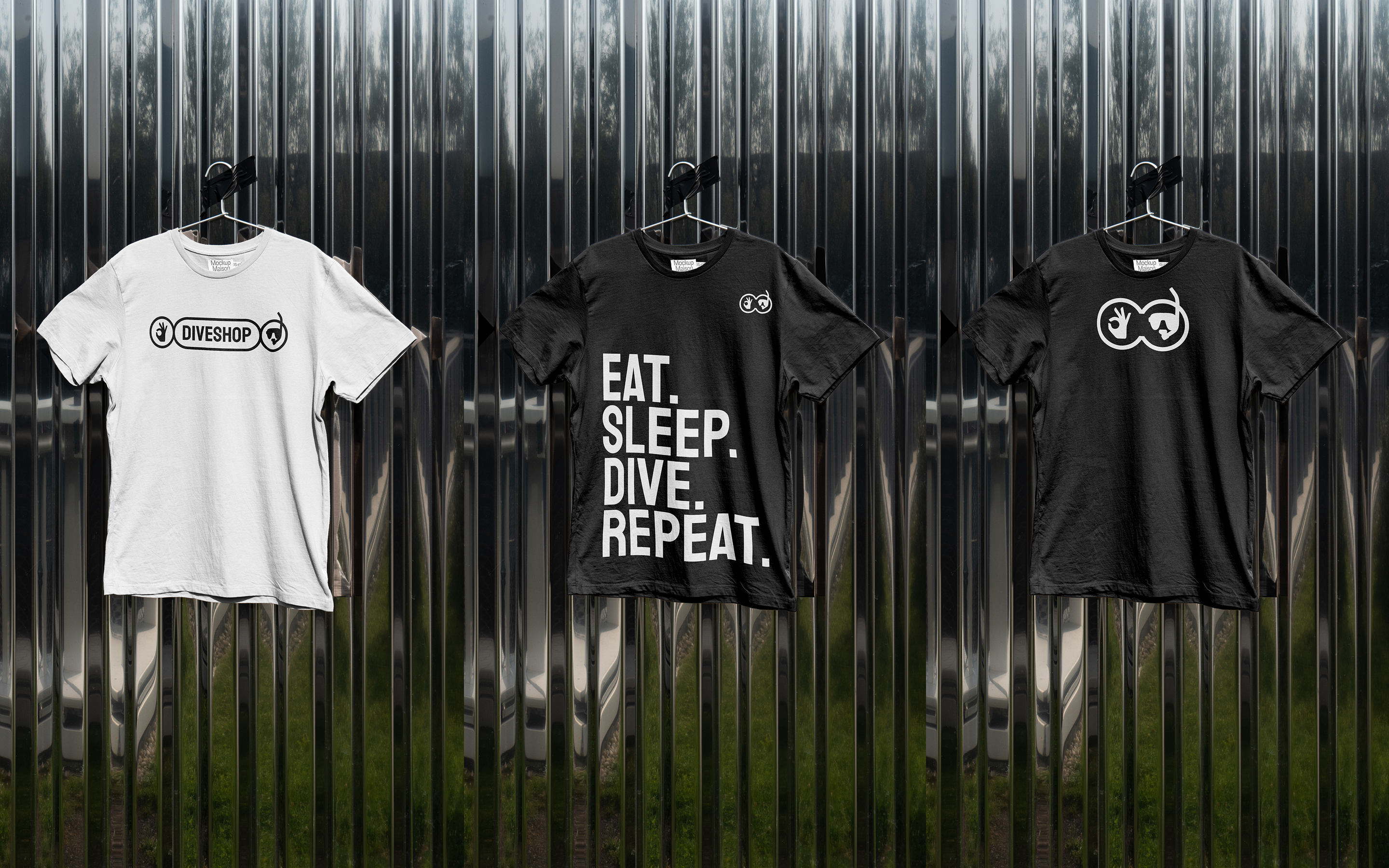
Brand carriers
I tested the language on stickers and T-shirts to validate recognizability and flexibility outside UI
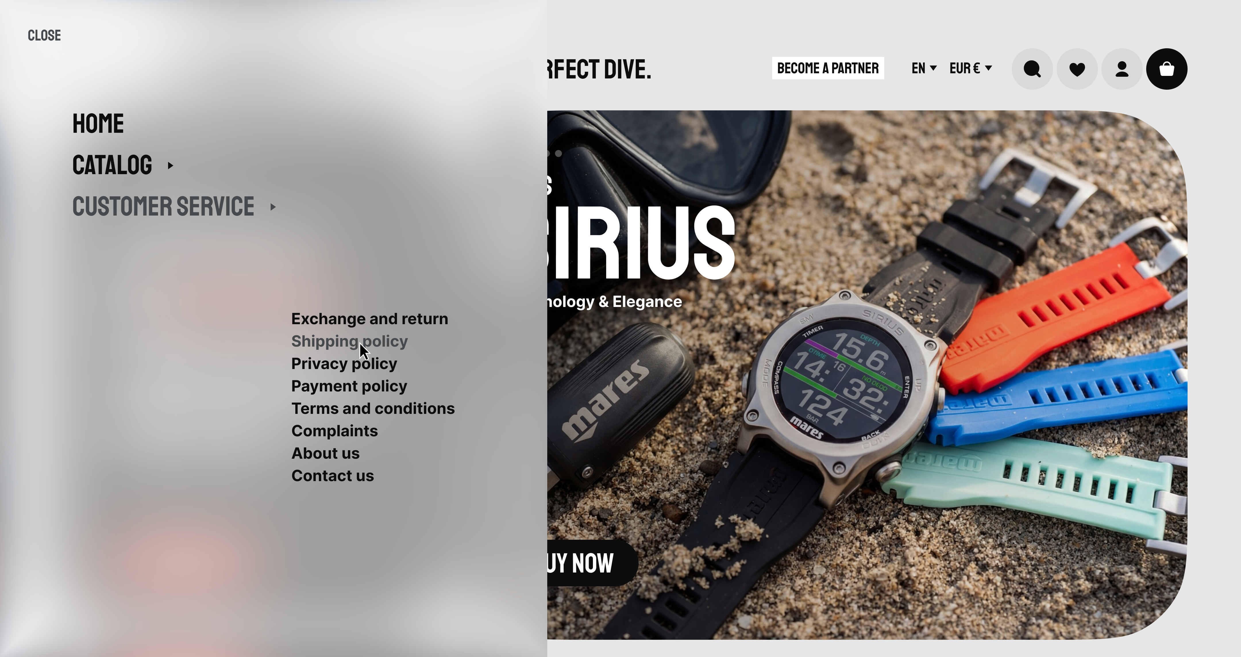
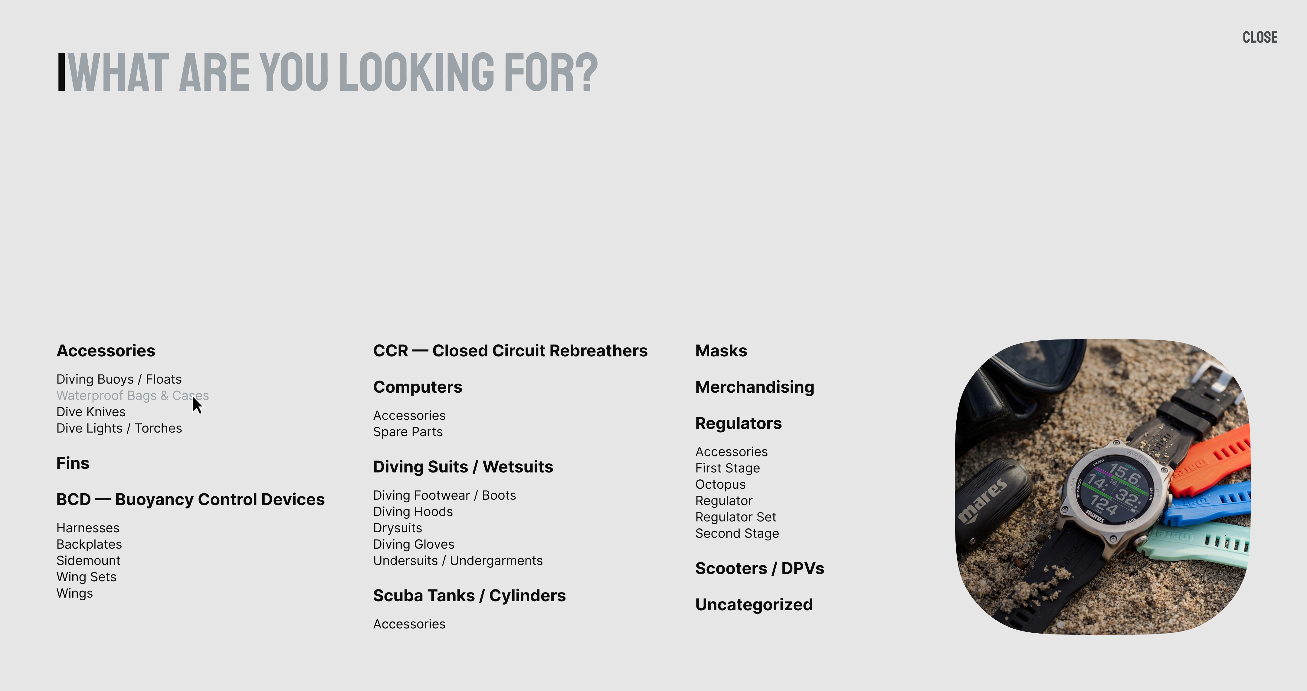
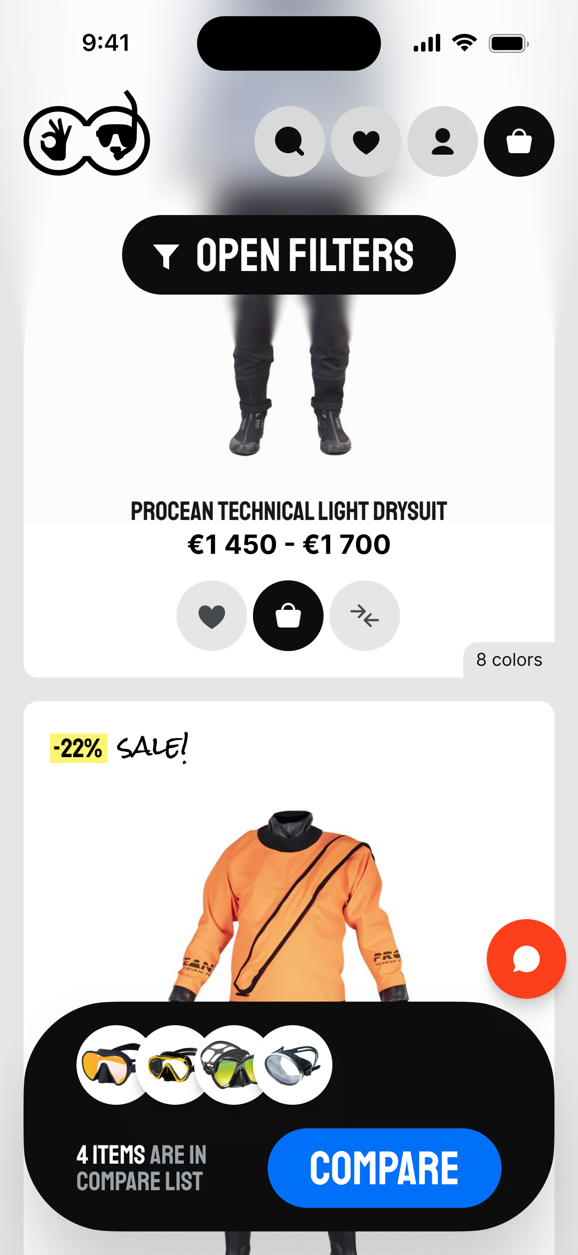
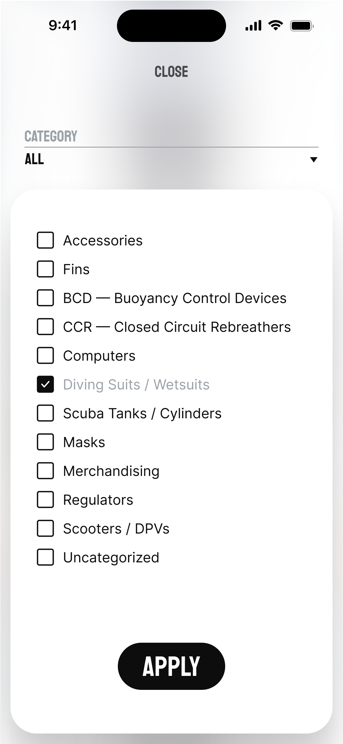
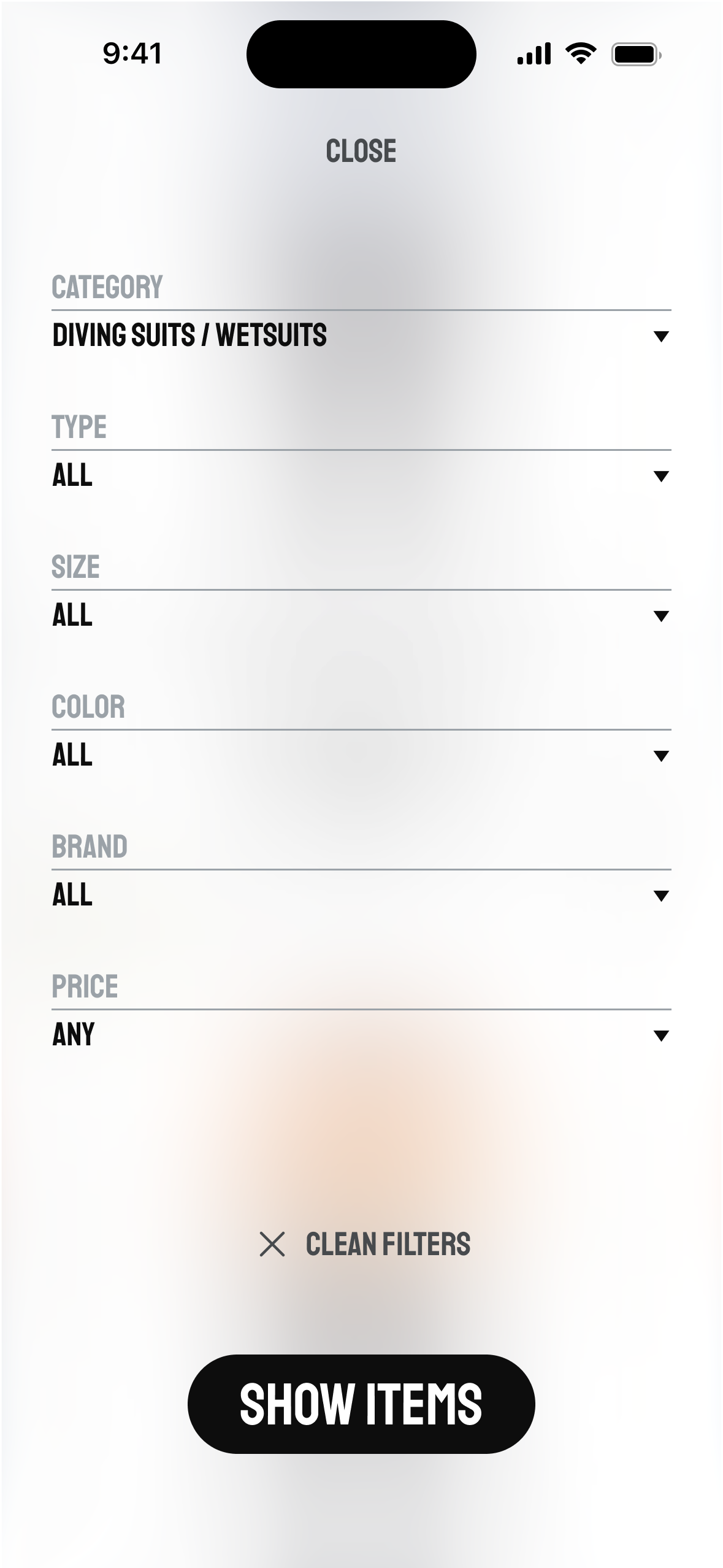
Site design
I moved from brand-only assets into early product mood exploration to show how the identity behaves in interface context